I’ve seen too many businesses waste money on merchandise where their logo barely shows up.
You know the problem. You order shirts or hats and when they arrive, your logo looks faded or tiny or just plain cheap. It doesn’t represent your brand the way you imagined.
Your logo should be the star of your merchandise. Not an afterthought.
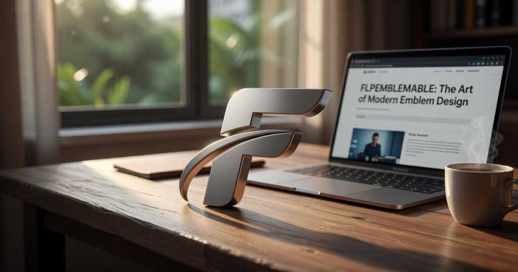
I work with visual branding every day at flpemblemable. I’ve tested different products and application methods to figure out what actually makes logos pop. What makes people want to wear your stuff instead of tossing it in a drawer.
This guide will show you how to feature your logo prominently on merchandise. You’ll learn which products work best, which application techniques deliver the cleanest results, and the design principles that make your logo impossible to miss.
We’re not talking about slapping your logo on anything that holds still. We’re talking about turning your brand into something people actually want to wear.
I’ll walk you through the choices that matter and the mistakes that kill your impact before you even start.
Beyond Branding: The Power of a Prominent Logo
I have a confession.
I used to think big logos were tacky. You know the type. Giant brand names splashed across everything like walking billboards.
Then I started Flpemblemable here in Kirkland.
And I completely changed my mind.
From Billboard to Badge of Honor
Here’s what shifted for me. A well-placed logo isn’t about shouting. It’s about belonging.
When someone wears a shirt with a bold logo, they’re not just carrying your brand. They’re claiming it. There’s a difference between handing out freebies people stuff in a drawer and creating something they actually want to wear.
I’ve watched this happen. People turn down plain merchandise all the time. But put a strong logo on quality fabric? They ask for extras.
The Psychology of Boldness
A confident logo does three things:
- It shows you’re not afraid to be seen
- It creates instant recognition (even from across a parking lot)
- It builds community among people who wear it
Think about it. When you see someone wearing the same band shirt or coffee shop logo you love, there’s this tiny moment of connection. That’s not marketing. That’s human nature.
Some designers will tell you subtlety is everything. Small logos tucked away in corners. Whisper-quiet branding.
But I think that’s missing the point. Sometimes you want to whisper. Sometimes you want to declare.
The Wearable Art Concept
Here’s where it gets interesting for me.
A logo on a tote bag or t-shirt can be more than promotion. It can be a design element in its own right. Something that represents your creative spirit.
I see it as wearable art. Your brand’s visual identity becomes part of someone’s daily aesthetic. That’s powerful.
Choosing the Right Canvas: Merchandise That Showcases Your Logo
Not all merchandise is created equal.
I’ve seen too many brands slap their logo on whatever’s cheap and wonder why nobody wears it. The truth? Your canvas matters just as much as your design.
Let me break down what actually works.
Apparel gives you the most real estate. T-shirts are obvious but think beyond the basic chest print. A full front design or an oversized back graphic turns your logo into a statement. Hoodies work the same way (center chest hits different than a tiny corner placement).
Here’s what most people overlook: fabric quality changes everything. A logo on heavyweight cotton looks premium. That same design on thin, scratchy material? It screams cheap.
And I’ll make a prediction here. Within the next two years, we’re going to see a major shift toward oversized silhouettes in branded apparel. The boxy fit trend isn’t going anywhere, which means MORE space for your logo to breathe.
Accessories offer something apparel can’t. Constant visibility.
Tote bags and drawstring bags have large, flat surfaces that are perfect for bold logos. People carry them everywhere. Your brand gets seen at the gym, the grocery store, the coffee shop.
Notebooks work too, especially if you’re targeting students or creatives who actually use them daily.
Compare that to something like keychains or pins. Sure, they’re cheaper. But good luck making your logo visible from more than two feet away.
Everyday objects turn users into walking billboards. Mugs sit on desks during Zoom calls. Water bottles go to the gym. Phone cases? Those get seen hundreds of times a day.
The key with drinkware is wraparound printing. Don’t just stick your logo on one side. Wrap it around the entire surface so it’s visible no matter how someone holds it.
I’ve worked with flpemblemable long enough to know this: the merchandise you choose sends a message about your brand before anyone even reads your logo.
Pick your canvas wisely.
A Masterclass in Methods: Creative Techniques for Logo Application
You’ve got your logo nailed down. Now what?
Most people think slapping it on a shirt is simple. Pick a method and go. But the technique you choose changes everything about how your logo looks and feels.
I’ve worked with artists and businesses who’ve learned this the hard way. They pick the wrong application method and their beautiful logo ends up looking flat or cheap. Choosing the right application method is crucial, as I’ve seen firsthand how a poorly executed design can transform a brand’s stunning logo into something that appears flat or cheap, ultimately affecting even its presentation on the .
Let me walk you through the four main techniques we use at flpemblemable.
1. Screen Printing for Bold Graphic Impact
This is the workhorse of logo application.
Screen printing works best when you’ve got a logo with one to three solid colors. No gradients. No photographic details. Just clean, bold graphics.
Here’s why it matters. The ink sits on top of the fabric and creates this vibrant, painted-on feel. It’s durable too. These prints survive dozens of washes without fading.
The real win? Cost. When you’re printing large batches, screen printing keeps your price per piece low. That’s why you see it everywhere from band merch to corporate uniforms.
2. Embroidery for Texture, Depth, and Prestige
Want your logo to feel premium?
Embroidery does that. The stitching adds a three-dimensional quality you can’t get with printing. Run your finger over it and you feel the texture.
I use this technique for hats, polos, and jackets. It just looks right on those pieces. There’s a reason country clubs and golf courses go with embroidery. It signals quality.
And here’s something cool. Puff embroidery takes it further by adding foam under the stitches. Your logo physically rises off the fabric. It catches light differently and demands attention.
(Just know that embroidery works best with simpler designs. Too much detail and those tiny stitches start to blur together.)
3. Direct-to-Garment for Full-Color Artistry
Got a complex logo with multiple colors? Maybe something with gradients or photographic elements?
DTG is your answer.
Direct-to-garment printing works like an inkjet printer for fabric. It can reproduce the full spectrum of colors with photographic detail. Your garment becomes a canvas.
This technique shines when you’re working with artwork that has depth and complexity. Think illustrated designs or logos with subtle color transitions. Screen printing can’t touch that level of detail.
The tradeoff? It costs more per piece than screen printing. But for small batches or one-off custom pieces, DTG makes sense.
4. Sublimation for All-Over Design
This one’s different.
Sublimation doesn’t print on top of the fabric. It infuses the ink into the fibers themselves. The result is permanent. It won’t crack, peel, or fade because it’s part of the fabric now.
Where sublimation really stands out is all-over printing. You can create edge-to-edge patterns where your logo integrates into the entire design. Not just placed on the chest or back, but woven throughout the whole garment.
I’ve seen artists use this for wild, immersive designs. The kind where the shirt itself becomes the artwork.
One catch though. Sublimation only works on polyester or poly-blend fabrics. The science behind it requires synthetic fibers to bond with the ink.
So which method should you choose?
That depends on your logo, your budget, and the feeling you want to create. But now you know Why Do You Need a Logo for Your Business Flpemblemable and how to bring it to life on fabric.
Design Principles: Making Your Prominent Logo Look Intentional, Not Obnoxious
Here’s what most people get wrong about big logos.
They think bigger automatically means better. So they slap their logo across a hoodie and wonder why it looks cheap instead of bold.
The truth? Size isn’t the problem. It’s how you handle everything around it.
Give Your Logo Room to Breathe
I’m going to tell you something that sounds backwards.
The best way to make your logo stand out is to surround it with nothing.
Negative space works like a frame. When you leave empty areas around your design, your eye naturally goes to what’s there. The logo becomes the focal point instead of just another element fighting for attention.
Think about it this way. A painting looks better with a mat and frame than crammed edge to edge in a cheap holder.
Your flpemblemable merchandise works the same way.
Pick Your Contrast Carefully
Now let’s talk color.
You’ve got two paths here. High contrast or tonal subtlety. Both work, but they send different messages.
White on black? That’s classic. It pops. People see it from across the room. Great for logos with clean lines and strong shapes.
But sometimes you want something quieter. Dark grey on black creates depth without screaming. It feels more premium, more considered.
My recommendation? Match your contrast choice to where the piece will be worn. Gym gear and streetwear can handle bold contrast. Corporate or upscale items often benefit from tonal approaches.
Always Start With Vector Files
This one’s non-negotiable.
If you’re scaling a logo up to cover a hoodie back, you need vector files. AI, EPS, or SVG formats.
Raster images (like JPEGs or PNGs) fall apart when you blow them up. You’ll see pixelation and fuzzy edges. It looks amateur, and there’s no fixing it after the fact. To ensure that your brand stands out with clarity and professionalism, it’s essential to consider the question, “Why Do You Need a Logo for Your Business Flpemblemable,” especially when the limitations of raster images can lead to unsightly pixelation that undermines your visual identity.
Vector files scale infinitely without losing quality. Period.
Wear Your Brand with Confidence
You now have the blueprint.
You know how to choose the right item, pick the best technique, and apply thoughtful design. Your logo doesn’t have to end up on forgettable swag that people toss in a drawer.
I’ve seen too many brands settle for cheap-looking merchandise that does more harm than good.
The fix is simple. Treat your merchandise as a creative canvas. Your logo becomes a statement of quality and pride when you approach it this way.
Here’s what you should do next: Start planning your next merchandise project as an investment in wearable art. Not as a marketing expense. Think about what represents your brand’s best self and build from there.
flpemblemable exists to help you see merchandise differently. We believe every piece should reflect the care you put into your brand.
Your next project can be the one that makes people want to wear your logo. Not because they have to, but because they want to. How Can I Create a Logo for Free Flpemblemable.
 Trevana Kelthorne has opinions about essential techniques and tools. Informed ones, backed by real experience — but opinions nonetheless, and they doesn't try to disguise them as neutral observation. They thinks a lot of what gets written about Essential Techniques and Tools, Art Exhibitions and Reviews, Artist Spotlights is either too cautious to be useful or too confident to be credible, and they's work tends to sit deliberately in the space between those two failure modes.
Reading Trevana's pieces, you get the sense of someone who has thought about this stuff seriously and arrived at actual conclusions — not just collected a range of perspectives and declined to pick one. That can be uncomfortable when they lands on something you disagree with. It's also why the writing is worth engaging with. Trevana isn't interested in telling people what they want to hear. They is interested in telling them what they actually thinks, with enough reasoning behind it that you can push back if you want to. That kind of intellectual honesty is rarer than it should be.
What Trevana is best at is the moment when a familiar topic reveals something unexpected — when the conventional wisdom turns out to be slightly off, or when a small shift in framing changes everything. They finds those moments consistently, which is why they's work tends to generate real discussion rather than just passive agreement.
Trevana Kelthorne has opinions about essential techniques and tools. Informed ones, backed by real experience — but opinions nonetheless, and they doesn't try to disguise them as neutral observation. They thinks a lot of what gets written about Essential Techniques and Tools, Art Exhibitions and Reviews, Artist Spotlights is either too cautious to be useful or too confident to be credible, and they's work tends to sit deliberately in the space between those two failure modes.
Reading Trevana's pieces, you get the sense of someone who has thought about this stuff seriously and arrived at actual conclusions — not just collected a range of perspectives and declined to pick one. That can be uncomfortable when they lands on something you disagree with. It's also why the writing is worth engaging with. Trevana isn't interested in telling people what they want to hear. They is interested in telling them what they actually thinks, with enough reasoning behind it that you can push back if you want to. That kind of intellectual honesty is rarer than it should be.
What Trevana is best at is the moment when a familiar topic reveals something unexpected — when the conventional wisdom turns out to be slightly off, or when a small shift in framing changes everything. They finds those moments consistently, which is why they's work tends to generate real discussion rather than just passive agreement.